A Profound Waste of Time (APWOT) is an award-winning independent videogames magazine. The magazine has been running a decade, running successful Kickstarter campaigns on an annual schedule.
APWOT’s original site was built by We Sort: a simple static site listing magazine issues, linked to a Shopify store for purchases.
This site had more than served its purpose, giving APWOT a simple and easy-to-manage e-commerce web presence.
Project goals
-
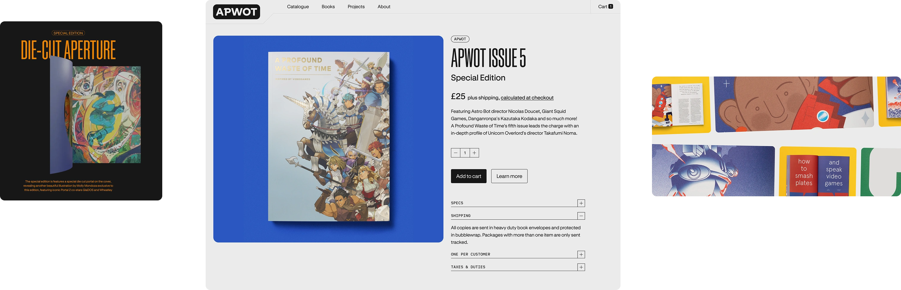
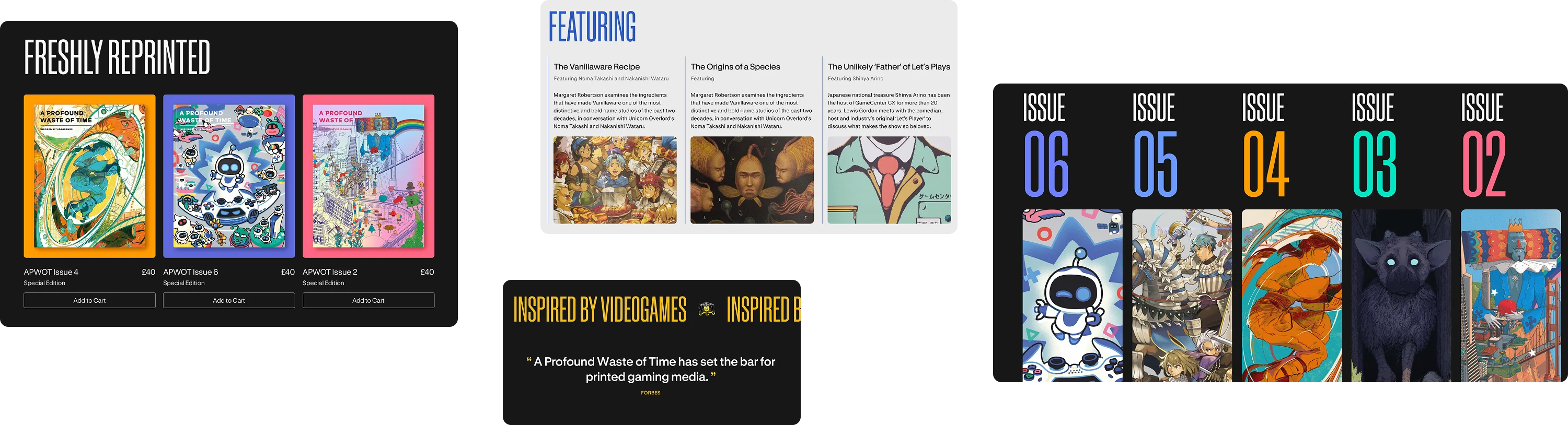
Showcase each magazine issue and highlight the features of Special Editions.
-
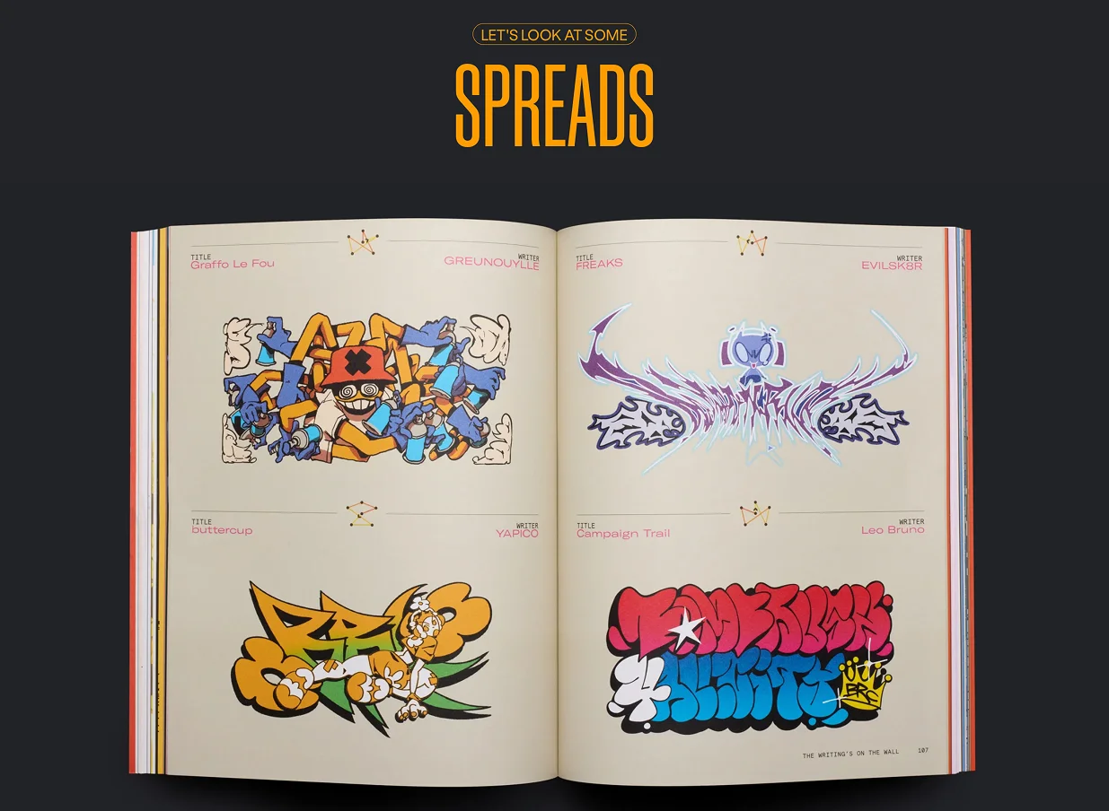
Show off the magazine’s physicality, custom illustrations and incredible access to people in the videogames industry.
-
Streamline the purchase experience, combining the two existing sites into a seamless checkout flow.
-
Establish a visual language and system of website modules that allow for future expansion.
-
Improve product discoverability so readers can find and buy related projects more easily.
-
Spotlight APWOT’s amazing photography, animation and videos.
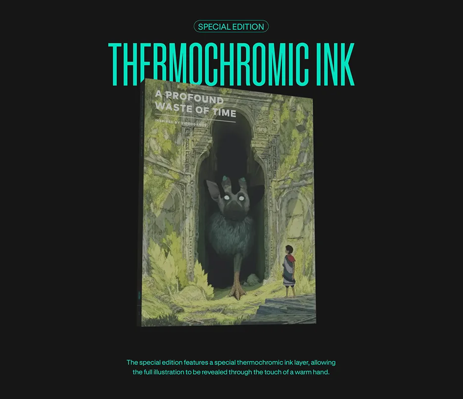
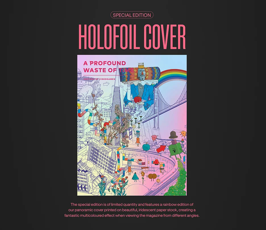
The first version of APWOT’s site had two elements: a static site with information about the magazines alongside a separate Shopify store where customers could purchase the magazines. From discovery, we knew that one of the core goals was to combine these sites so the purchasing experience felt cohesive and streamlined.
To do this, we created a new information architecture for the site. We plotted key user journeys, and devised a new structure that would let APWOT create landing pages for each of their most important products.
We built on this thinking by wireframing the key pages on the site. This process set a strong initial direction for content hierarchy in important areas, such as magazine landing pages, and gave us some tangible ideas to discuss and work with.
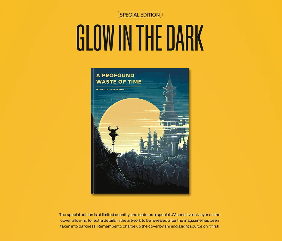
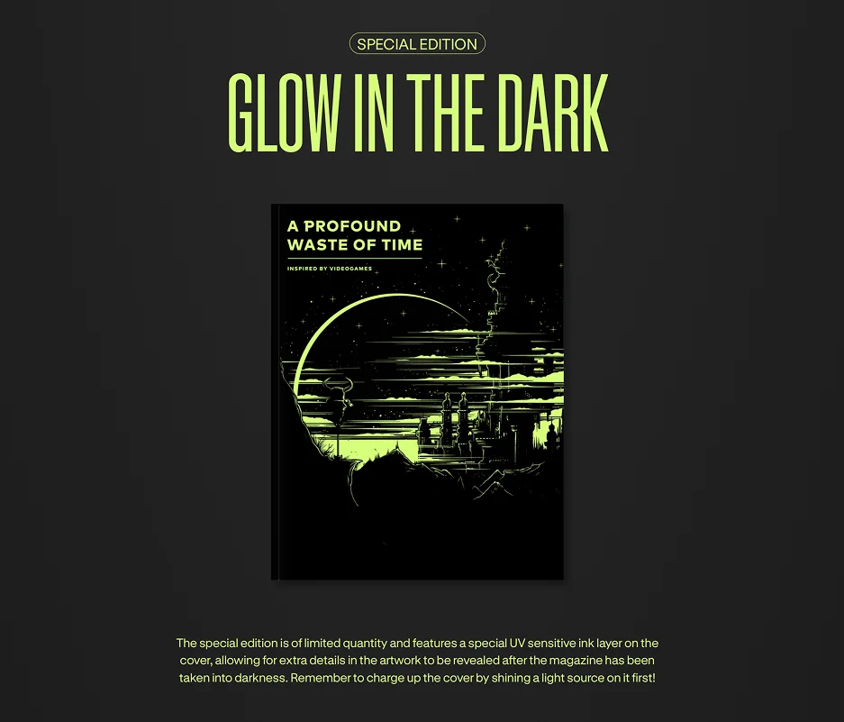
With over a decade of established print and social media design language, there was a significant body of work for the new site to draw inspiration from. We wanted the site’s design to feel connected to the magazines, carrying the thread of playful elements to the digital medium.
This phase involved a lot of iteration and collaboration to settle on the right visual direction. For all the playfulness and vibrancy that we wanted the site to project, we also needed to maintain a clear and accessible user experience, that worked with the grain of the web.
The project was a particularly collaborative effort with Rob de Kort (Studio 1902), our development partner. Rob was involved early in the design phase, creating demos for various pieces of interactive functionality.
Rob is brilliant at taking design intent and converting it into a great web experience. In this case, that also meant developing lots of complex interactions while making them as simple to use and accessible as possible.
The site has been designed and built around a series of flexible modules that let APWOT manage content independently, and they were able to add all of the site’s initial content without external support.
Project results
-
Combined and cohesive ecommerce store with a streamlined checkout experience.
-
Playful, vibrant and accessible design language that’s connected to the magazine.
-
Customers checking out with more items in their basket, demonstrating an instant impact from the new site.
-
Easy-to-manage and modular content editing experience.
More case studies
-
Collaborated with US-based software development company Lucky Media to redesign their marketing site, pushing their brand in a new direction.
2024
-
Partnered with Secure Practice’s in-house development team to build their first design system, improving the UX and accessibility of their apps, plus streamlining development of new features.
2026