After redesigning their marketing site, Secure Practice asked me to modernise their learning platforms. The platforms had evolved organically over many years and iterations, so there were lots of opportunities to improve and refine the user experience.
This was a large and complicated project for lots of reasons, in particular:
Scale: There were several apps for various users: a learning portal for people completing courses, two similar-but-not-the-same management platforms for content creation and editing. Later, a fourth app was created that was related to these management platforms with a different set of needs.
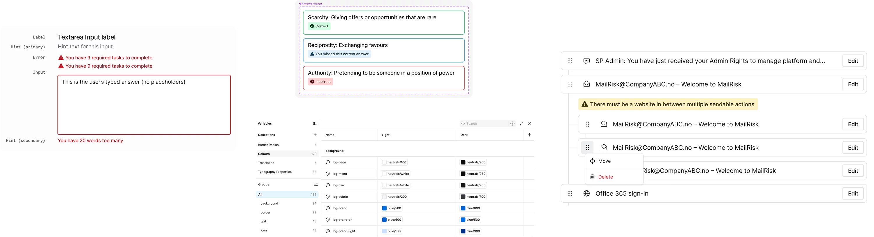
Complex requirements: The content management side of the platform features lots of options that users can configure. Content could also exist in various states (e.g. published, unpublished, needing translation), plus the content could be nested, too. The platforms are natively multilingual, which added another layer of complexity to many interactions.
As the original platform had developed organically, there was no component library or documentation of components: they only existed in code. The project started with a thorough manual component audit, and it was difficult to capture everything. This step required a lot of coordination with developers who assisted in revealing difficult-to-uncover components.
-
Working with Dave made me a better developer. His deep knowledge of accessibility, HTML/CSS and UX principles, was a key factor in ensuring a polished and accessible component library.

It became clear early on that the application would benefit from either a component library or design system. Some of the goals we wanted to achieve included improving:
Consistency and efficiency of development, especially reducing one-off component variations
Visibility into existing components, both for developers and non-developers
Documentation of components: implementation details, accessibility, decision rationale
Following Dan Mall’s approach to design systems, we started small with the most common elements, and built from there. Ultimately, the system exists as follows:
Figma UI Kit: Documentation of design intent
Storybook: The “source of truth”. The components here are pulled through to the live apps.
Confluence: Additional research, rationale, notes and implementation details.
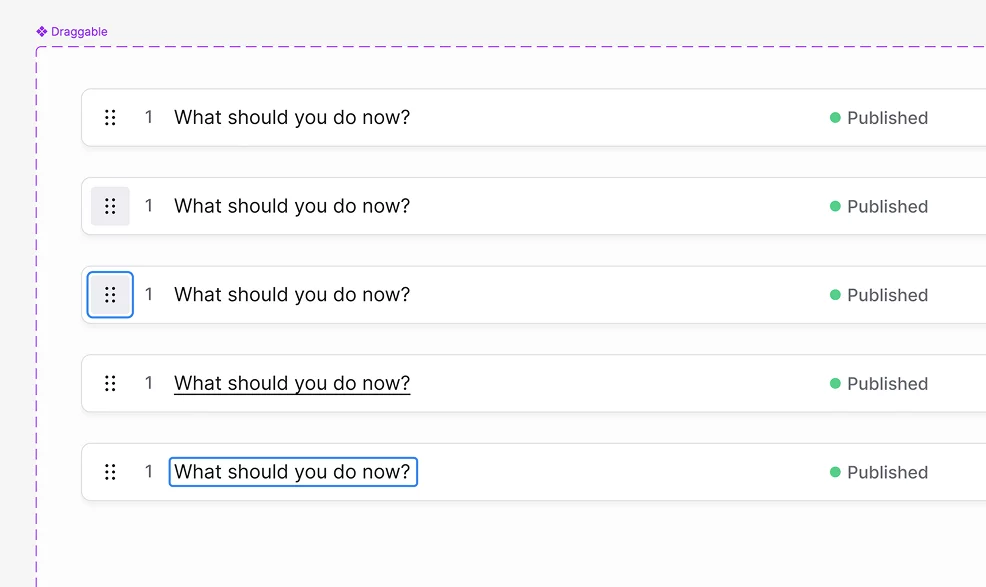
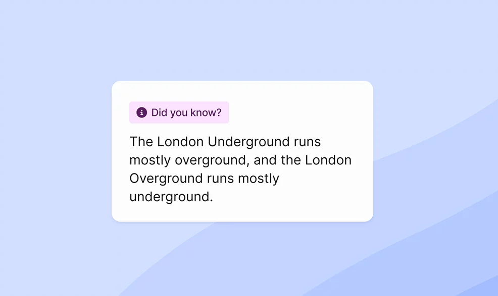
The project was a big change from the short-term projects I’d previously worked, but I loved collaborating with the team and getting into the details on the system. Projects like this let us get into the weeds on some gnarly UX and UI elements, and tackle challenges that don’t often come up on smaller projects.
The complex needs of this project meant lots of cross-team collaboration and iteration between content, customer and development teams. Ultimately, we created a component/layout system that could handle the flexibility needed across the various apps, whilst retaining the utility of patterns that developers could lean on for future iterations.
-
Dave creates Figma designs with the final implementation in mind making development a breeze. He makes the people around him better, always willing to share his design knowledge and explain the reasoning behind his decisions.
Roles and outcomes
-
Established a new design language with patterns that improve usability, information architecture and accessibility across the apps. The updated design also improves clarity for the most complex interactions within the apps.
-
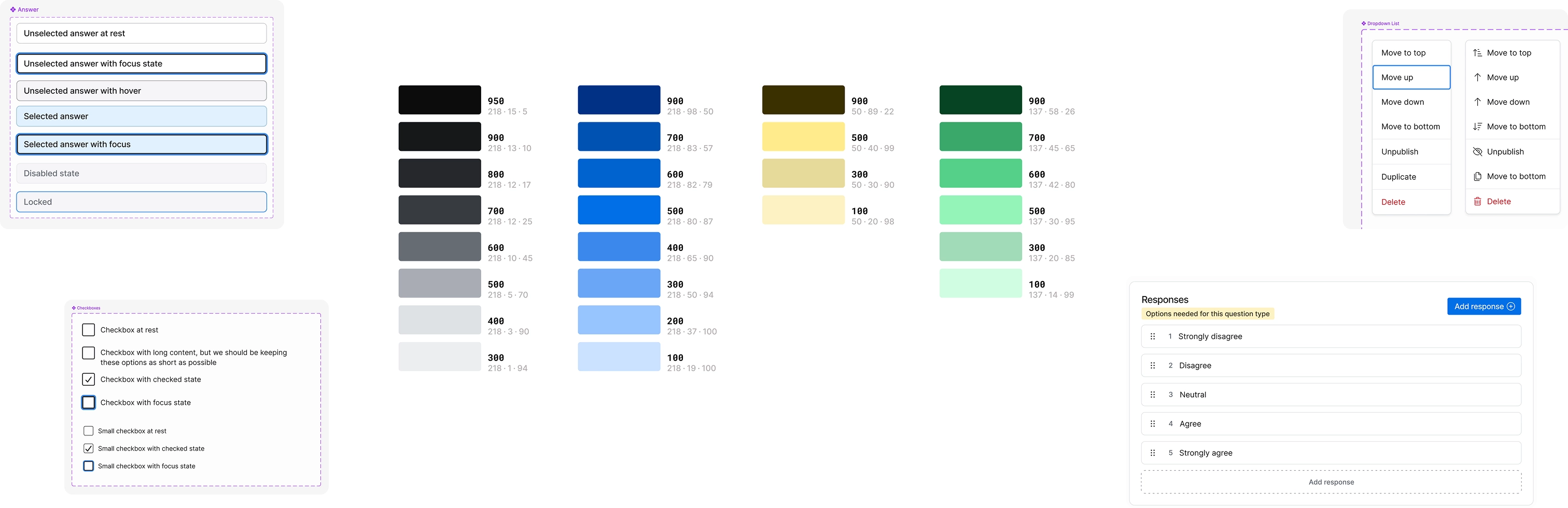
I created a Figma UI kit using components, auto layout and variations that can be toggled between light and dark mode at the flick of a switch.
-
The Figma component library establishes accessible patterns that can be reused across the various apps and used by non-developers to quickly pull together new views.
-
Alongside Secure Practice’s in-house developers, we used Storybook to house the developed components. I performed design QA here and in the live apps, pushing light visual polish tweaks to production.
-
Built organisational knowledge of accessibility and UX best practices, with documentation of approaches and decision-making for each component.
-
Reduced the number of ‘one-off’ components across the system, and improved visibility into available components by documenting these in the Figma UI kit.
-
The platforms are multilingual with English and Norwegian as the primary languages. I started learning Norwegian to help me quickly understand views I’d see in that language. Current Duolingo streak: over 800 days.
More case studies
-
Redesign of Secure Practice’s marketing site, in partnership with Andra Zaharia and Studio 1902.
2023
-
Collaborated with US-based software development company Lucky Media to redesign their marketing site, pushing their brand in a new direction.
2024